Designing User Interface in the Trading Software
Users of modern trading platforms demand complex features and flexibility for their day-to-day tasks, and it is the UI designer’s job to satisfy those needs. This article gives a brief overview of some modern approaches towards workspace organization for complex user interfaces.

On the surface, trading seems like a no-brainer from the user interface standpoint: all you need is to buy low, sell high, and some enthusiasm in trading to make your billions.
In other words, the tasks that a user needs to complete within a trading platform, are:
- Determine an object to buy or sell (this object is usually called an instrument)
- Determine the time that is best to buy or sell
- Perform the buy or sell
- Monitor the impact of the transaction on your account.
It seems easy enough. A user interface that would make this simple-minded trader happy would then look like this.
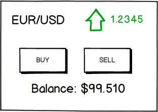
UI done! Piece of cake, wasn’t it? However the trading process and a workable UI design for it is not that simple.
The first issue is the method of buying and selling things on the exchanges. This is usually done by means of trading orders, which are statements with a strict syntax that tell the system you would like to perform some action on a tradable object.
| The simplest order is your intent to buy | Buy the good ABC |
| You would normally like to have a certain price on that, so your order would be | Buy the good ABC at price X |
| … or cheaper than that, if the market permits | Buy the good ABC at price X or lower |
| You may also want to define simple time conditions | Buy the good ABC at price X or lower after 12pm |
| …or more tricky ones, like | Buy the good ABC at price X or lower after 12pm if the price for A had raised for the past 10 deals |
| … and for sophisticated trading, you’d start adding further actions like | … and for sophisticated trading, you’d start adding further actions like |
…and so on. These are definitely not the most complex cases available, either. The problem is that the UI for sending such orders has to accommodate all of these potential scenarios.
But there are still more things that add further complexity, such as requirements and user interfaces that differ depending on what the user is trading (e.g. stocks, FOREX, options or futures), what their goals are (investment or speculation), what the user’s role is in the process, etc.
And there’s still more beyond all of this. One will need a completely different UI should they engage in algorithmic trade. After all, you don’t want just two buttons to control that wicked robot capable of running your account balance down from 100K to zero in no time. Consequently, the tools are completely different if you make the switch from manual to “algo”.
Yet another thing to mention is that professional traders want professional tools. From the user interface standpoint, this means “professionally looking”, or simply speaking, “something that doesn’t look too simple”. The professional trading UI needs to have enough complexity and power to meet all of the potential needs of clients, and yet still be user-friendly despite appearing somewhat intimidating at first glance. It turns out that this relates not only to true pro apps but also for amateurs—we all want to look like the cool guys, don’t we?
Normally, a trader would require several tools on the screen all at once. One doesn’t just issue an order and then stop and go watch quotes. Trading platforms tend to use every single screen pixel for useful information. The more dense the data output, the more tools must be readily available under your cursor.
Finally, let’s consider the desire for flexibility and the requirements to support multiple devices of various sizes to complete this real world nightmare of UI design problems. How do we simplify this and fit it all into a single application?

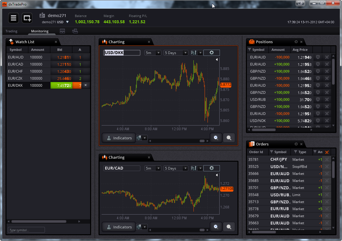
Someone familiar with modern operating systems like Windows might suggest that the multi-document approach could work here. You can set up boxes that can be resized, moved and positioned wherever one likes. In fact many developers implement this in their platforms.
The bad news is that this windowed approach needs some serious UI work. Either that or your trading platform screen becomes cluttered with garbage in no time. And – you cannot use this design for touchscreen devices.

So where do we start then? First of all, we must accept that different devices, be it smartphones, iPads or desktop computers, each need a different approach. There are existing strategies that can be used, as well as new smarter solutions can also be created. I’ll cover the findings from Devexperts’ experience that we use in designing our products for different devices:
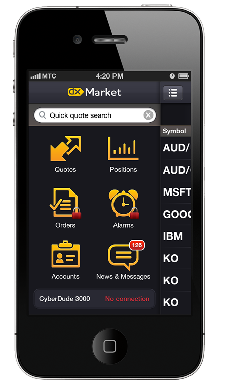
Smartphones and small devices
The problems with these begin with the small screen size:
- The in-app navigation selection eats up space
- You don’t see the big picture of your account’s state from the in-depth views
- You need different views of the same data, and they also eat up space
- Certain important forms (like order entry) can get very long, and it is no surprise that you quickly run out of space.
We solve these first two issues by setting up a dashboard that shows the “big picture” and that can be accessed by a simple gesture from everywhere in the app. The dashboard itself serves also as a navigation menu, so you can quickly switch between different tasks.
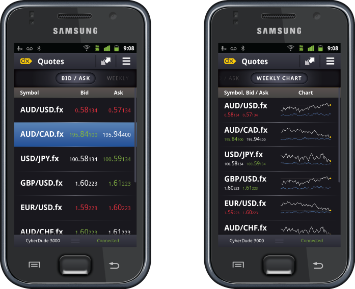
Simple gestures can be also used for data views. In the example below, you switch from one set of data columns to another by simply swiping the screen right or left.
The forms are made modular, which aids in creating complex orders, yet the main action button always stays on the screen.
iPad and tablets
A tablet computer seems much closer to a large PC, but still has some of the smartphone problems.
- Despite the bigger screen, users are still operating the tablet apps with their fingers. That is, the interactive controls must be somewhat large
- Users see the screen as bigger, so more data and more tool panels seem to fit; the classic “left-navigation-and-content” approach is too limiting for them
- Still, this multitude needs to give way to a big chart from time to time and somehow the UI has to combine both
- When you start trying to show more components than a single screen can fit, the user can easily get lost. This means that showing the path and the current position in the app are required
We started with giving the user the ability to have more than just two content panels. It can be a wide (yet limited) area that has zones…
…or a canvas of unlimited width that lets you add as many components as you like. Additional controls like the “quick-jump” were designed to ease navigation on such a canvas, but good old fashioned scrolling can also be used, and using a known pattern in the UI adds to the perceived ease-of-use.

Web and desktop platforms
Web and “native” apps now have much in common, including UI problems. Here are a few of the things that we design for:
- Ease of switching between multiple and single monitor configurations, e.g. from desktop PC to laptop
- Different screen layouts and tool sets for different tasks, all being easily switchable
- Resolving issues associated with a lack of screen “real estate”
- Ways of organizing screen layouts
- System performance and enhancement
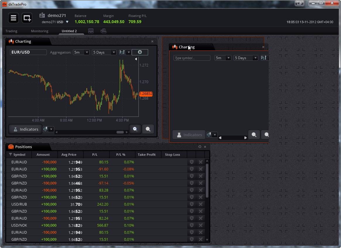
The major flaw in the multi-document (“windowed”) approach is the third dimension. Windows can overlap each other causing tools to get buried under where you need them. The first solution is to remove overlapping completely. This works fine for some cases.
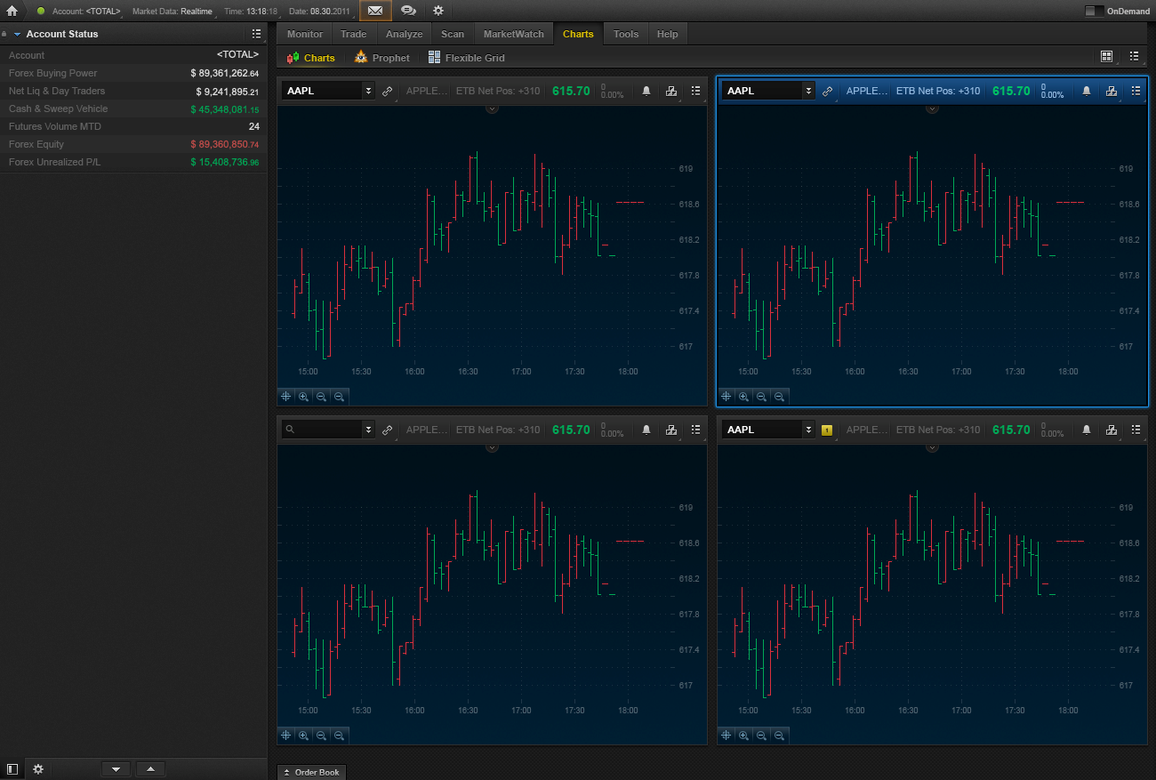
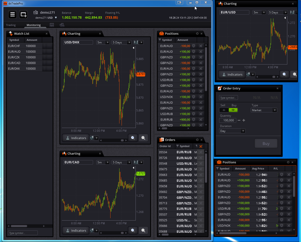
Since resizing and arranging components is a basic feature that users require from a desktop application, attention should be paid to this. Since the choice is often to remove the flaw of overlap, frameworks like the one used in editions of dxTradePro allow automatic ‘docking’ and splitting of the workspace to fit components. Presto! No more overlaps.
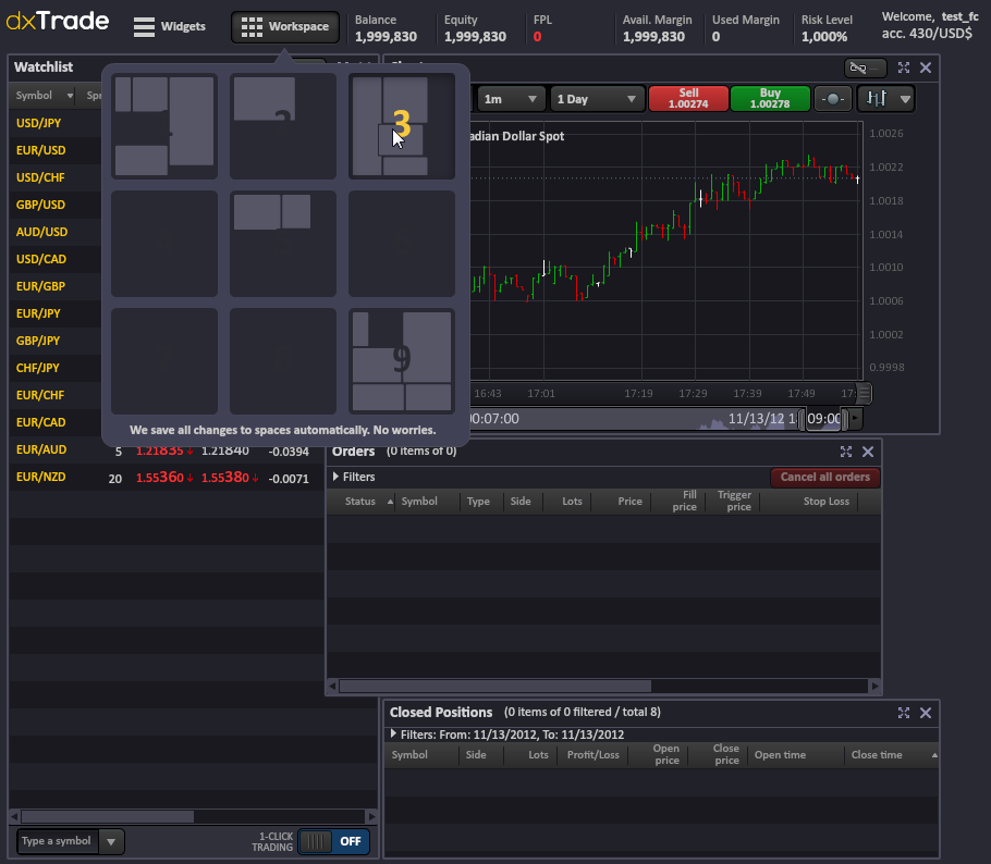
A useful addition both for “flat” frameworks that don’t allow overlap, and for 3D-enabled windows, is a way to organize the panels in a more creative and useful way than just a cascade.

If you still decide to stick to the more traditional window approach, remember that there are already a lot of things done. The multi-document approach can be enriched with tricks like sticky windows and a modular grid. In the latter case a window can only be resized by a multiple of a relatively small ‘module’ – this makes the entire layout much more organized and predictable in behavior.
Another frequently required option is to simultaneously enable different workspaces for different tasks (e.g. trading and monitoring), or to simply increase the space not available on a single monitor. We use different approaches here, from traditional tabs to something far more fancy-looking. The requirement met are much the same for all of them: that the switching should be simple, predictable and easily reversible.
Finally, there is always an option to create a new OS window for a component. Although you are relying on the quality of Microsoft’s or Apple’s work here, in some cases this is more acceptable to users and developers, so this option should be considered.
We hope this overview will help you make the right choices to aid workspace organization for your trading platform, or any system requiring a complex UI.