Chameleon: A Cozy Palette Management Tool
When a product suite is constantly evolving it can be a challenge to keep under control the combinatorial explosion of colors; particularly when you have to maintain a number of related products. This article describes the challenges, explores the different approaches and unveils the solution our UI designers and developers uncovered while customizing Devexperts trading applications.
The Problem
At Devexperts we produce Desktop, Web and Mobile UI trading applications. These applications look alike and have similar skins. They can be customized on request for a client, and this leads to the development of custom skins. In general, the first release of a custom skin for each customer is based on the initial product and slightly evolves during the product life cycle, which can last many years.
Now let’s look at the case in question.
Any trading application is a complex interface, consisting of multiple colors. Assigning different pixel-perfect editions for desktop, tablet, and mobile screens will triple that number. In addition, the designer works with several skins such as “day” and “night” themes or countless white-labels. This makes the situation difficult to manage and can result in a designer juggling thousands of colors.
Typical use-cases are:
- inspecting colors used in controls across all applications, editions and their white-labels
- controlling the opacity of an element
- adjusting the color appearance of any element
- comparing
- finding outdated colors, then updating and recoloring them synchronously in one product lineup
The labor intensive work outlined above is achieved by repeating every color occurrence in code. We use semantic names for these occurrences and call them variables. As you can imagine a certain amount of automation and discipline is needed in the color management process. But how can we embed automation? What can be a good instrument for designers to control and manage changes – and for developers to apply them?
Our goal
We set ourselves the goal of improving navigation, and simplifying (for all the parties involved in the development) the management of one or more color palette at a time.
This issue was uncovered by one of our designers while buried in color palette pages on Confluence wiki. They discovered that the amount of variables became innumerable.
Possible solutions
First we turned to some well-known applications.
1. Confluence or another Corporate Wiki
This is actually where we were stuck for quite some time. Here is why we abandoned Confluence pages:
1.1 Comparison problems
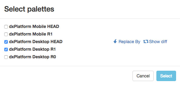
When using Confluence pages, one palette of an individual skin takes an entire page. When you have a mobile app with five skins it means you have five separate tabs and need to switch between them. Of course you can put all of the skins into one Confluence page with an aggregated color palette — just create a column for all five skins. This can solve the problem for some time. But for proper tracking of changes you need to create a new column for each “release” of the color palette. So the number of columns dramatically grows and as a result — it decreases the overall page performance in a browser and makes the data harder to scan with the naked eye. In addition, it’s impossible to compare two or more palettes of different projects without odd mouse clicks.
1.2 Time-consuming search of changes
A second example: working on a white-label project a designer made changes to a UI element, colored it in red, and after that informed a developer to apply it. In general, palettes do not change all that often between stages. They also stay consistent across editions, and any changes usually touch a small subset of variables. Despite this the developer has to manually find what was changed, scrolling pages all the way up and down, or, if they are lucky enough, using the search field. Sometimes they may even have to look at the page history of years-old releases, if variables look confusing.
Both a designer and a developer have to check whether the variables across several palettes are aligned, verify that the differences are intentional and a human mistake did not take place. Confluence has a special diff function that can be used to compare versions of color palettes. But it was designed for code or plain text. A table structure with colors and variables often ends up misaligned even when trying to check quite minor changes.
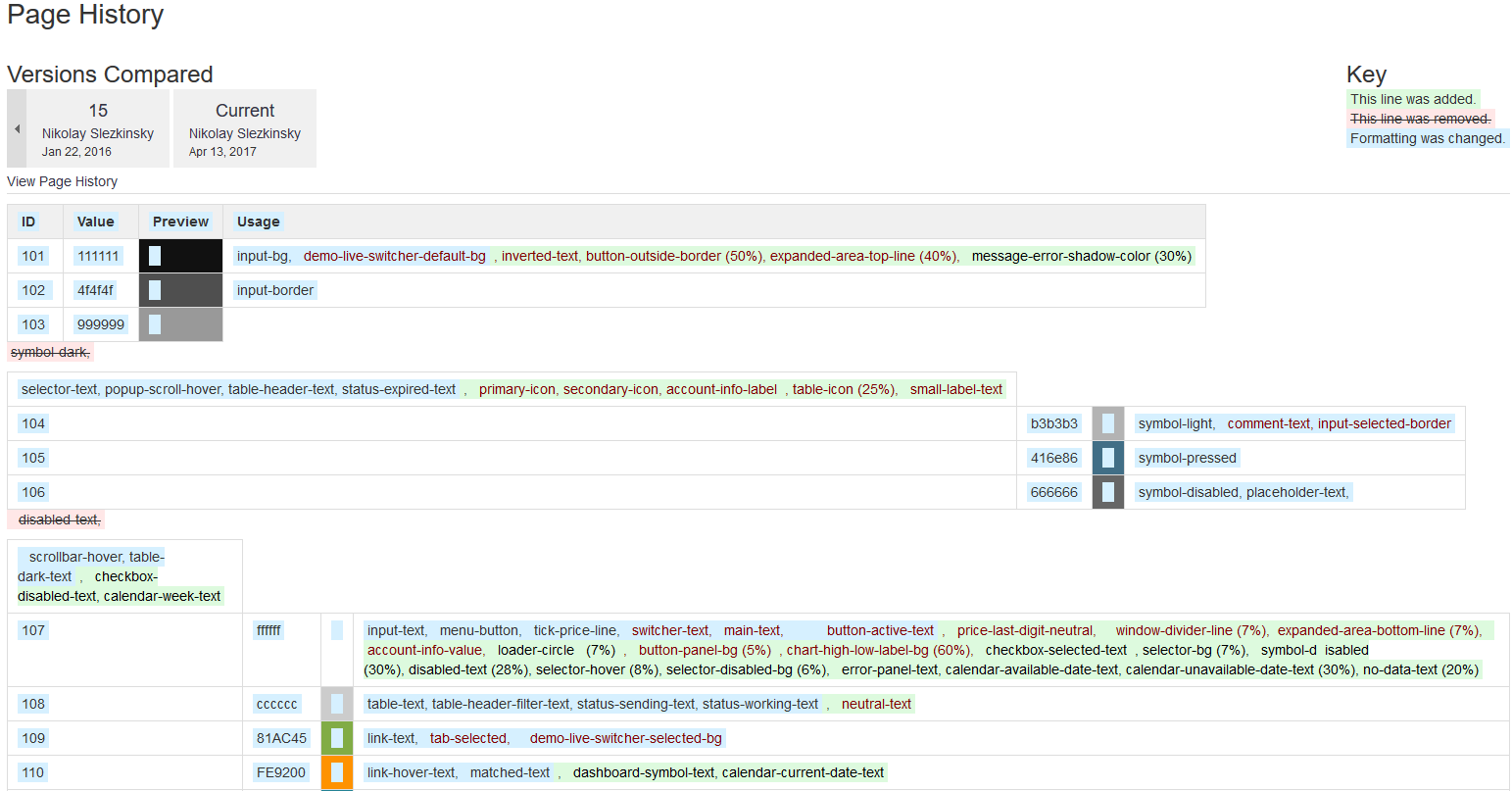

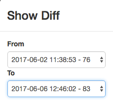
Take note that in addition you cannot name any changes in the history. So if you want to compare a new palette with a certain previous release, you need to remember the exact date and time of the release.
2. Spreadsheets / Excel-like Software
Google Sheets may first spring to mind. That would probably work fine for a small company with 2-3 applications or websites. Particularly, if you’re not expecting to work with multiple versions at the same time, or require a substantial expansion in the future with regards to themes, white-labels
However, it has the same weaknesses as a wiki. Let’s imagine the following situation: you have one color palette for one product consisting of 100 colors. After receiving orders for 10 white-labels and 4 app editions (desktop, web, tablet, smartphone) you will get 4k colors. Multiply this by Development, QA and Production stages and you’ll end up with 12k colors.
All web-based table/ spreadsheet software uploads all of the columns of stored color palettes. You can use the hide/ unhide option to select a specific subset of color palettes, but this is not convenient for the most popular case when you need just two exact color palettes out of 10 or 20+ palettes. Although Excel is a mighty tool, it requires you to perform extra mouse clicks and strain your eyes.
In addition, you also need to be disciplined and follow the same structure, which you defined to pre-existing skins, when you are in the process of creating another palette.
The revision history function in Google Sheets works in a similar way to Confluence pages and cannot visualize useful diff data between two exact versions (releases) of color palette. To compare the differences between the current and the previous version there is a whole class of software called VCS.
3. Version Control Systems
VCS is a great tool for text files. But here 2 major problems arise:
3.1 Comparison problem
VCS helps us to work with multiple revisions of one file. But engineers often need to compare two different palettes, and different palettes are represented with different files. VCS is not much help here, because it doesn’t consider these files as related.
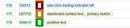
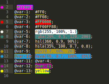
3.2 Color preview
VCS cannot depict colors in an accurate way, which is essential for a designer. Without a good preview you have to keep in mind the text color codes and check on them each time, which increases cognitive load. Basic color representation in some code-highlighting systems gives a better understanding of what is going on for one column of text, but it fails in comparison with a table structure with multiple columns and large colored cells.
With all of these problems and use-cases in mind and, after thoroughly exploring every possible option, we have developed a tool called Chameleon.
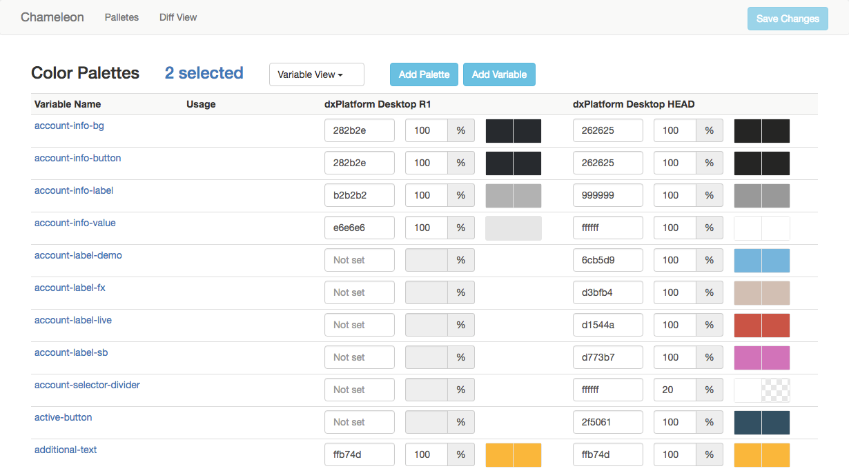
Chameleon
It is a web tool for color management that can be used for white-labels, releases and during all the production stages of new products.
Features for the Design Team:
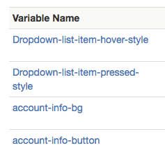
- Observe a list of variables and see how it was used in different color palettes for different projects.

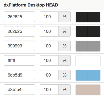
- Observe colors for all variables involved for a particular project.
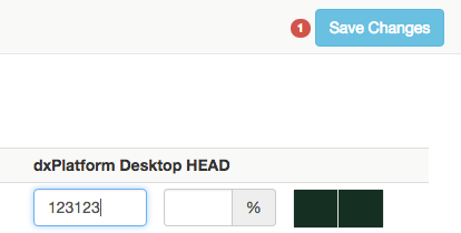
- Control and review changes during a current editing session.
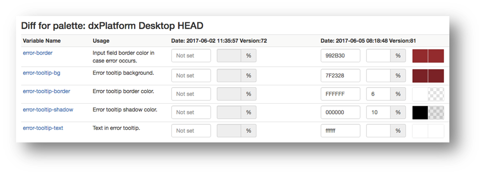
- Compare changes in a current palette with any version of this palette in the past.
Features for the Development teams:
- Design updates in production releases: Successful business projects go through milestone (releases) which are deployed in a production environment. In this case the color scheme of master and released projects must be separated. Sometimes, development teams get requests for new developments in already released versions. It saves significant time if a designer and a developer are able to load a snapshot of a released color scheme and slightly change it, rather than use color schemes of master versions which may quietly change since the release went to production.
- Incremental design updates: Development team members should be able to get diff between already applied versions of color schemes, and its current version for each release of their UI component.
A few words about the technologies we used:
Since this is a typical small-scale enterprise web app, we decided to use the tools which are most familiar to us and which would help us implement the solution quickly. For those who are interested in this particular example, we used:
- Spring-boot
- H2 Database Engine
- jsoup
- Junit
- WebJars
- AngularJS
- Bootstrap
- Swagger.
We opensourced Chameleon on GitHub for everyone. If you have thoughts on how to improve Chameleon, we would be pleased to hear from you – just leave a comment below!
Is the color management process a nightmare for you?