UI Release of dxProduct Suite for Brokers
This post is devoted to the release of our trade applications product suite, called “dx”. There are currently seven of them. They are based on different platforms: web, desktop, mobile and specially designed for different form-factors and OS.
Hi everyone!
My name is Nick and I’m leading the team responsible for the “dx” user interfaces and user experience. We design both Devexperts own “dx” applications, and white-labeled applications based on “dx-technology”.
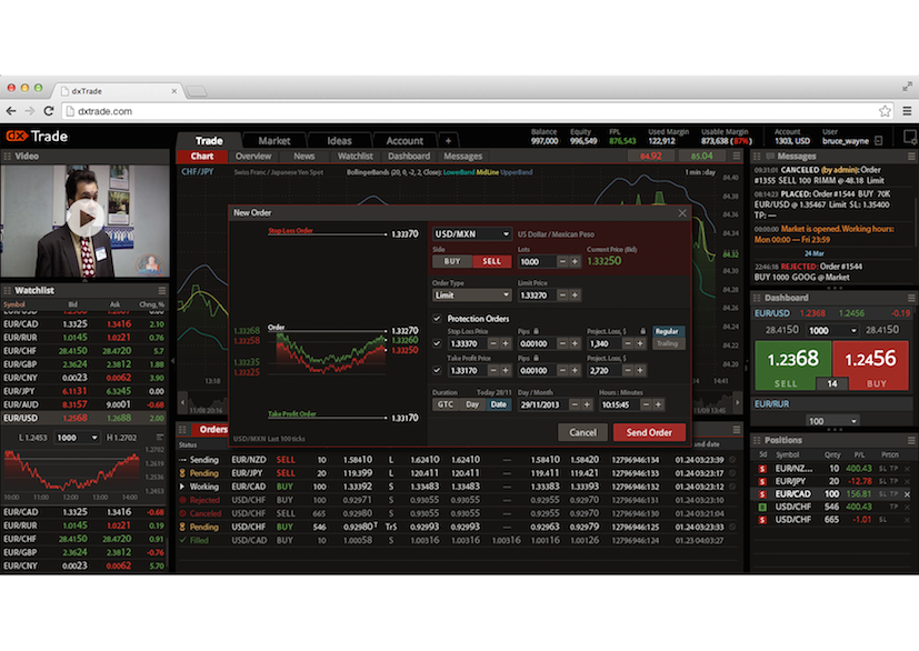
The purpose of this post is to tell you about the “dx product suite” UI release. Why did we decide to embark on such a great project? Well, we collected a critical mass of ideas concerning interface UI improvements for each of our applications, which we were not able to implement due to their obsolete application architecture design. For instance, dxTrade browser-based application predecessor just went out-of-date, because of the technology it was based on.
The main point of departure was our clients’ comments and users’ reviews, in particular regarding the applications being visually complex and operating slowly on old computers – they just hampered the systems. We registered all the mistakes, made a review of the ideas and our clients feedback and set to work.
Our goals were as follows:
- Redesign user experience of the platform in general as well as each individual component (widget);
- Design new visual identity;
- Create a guide-line;
- Implement a common visual identity style to all the dx applications.
During this work we had to consider the following aspects:
- Design and user experience should be completely on a par with business needs;
- Priority of the content over the form;
- The applications should work, and be perceived as an integral unit;
- The application’s shell has to be easy for white-labeling and implementation. It should not damp system operation.
- Bit-map graphics should be avoided in favour of vector graphics as far as possible.
All these demands have put their brakes on the final design. Considering all the above mentioned specifications we have chosen a supremely elegant flat design. Firstly, this empowered us to programme some interface’ elements and their modes. Secondly, such a solution did not overload the CPU. And finally, now we can easily modify the applications. In the foreseeable future all the artworks (logos, icons etc.) will migrate from bitmap formats (PNG/GIF) to vector (SVG and icon fonts).
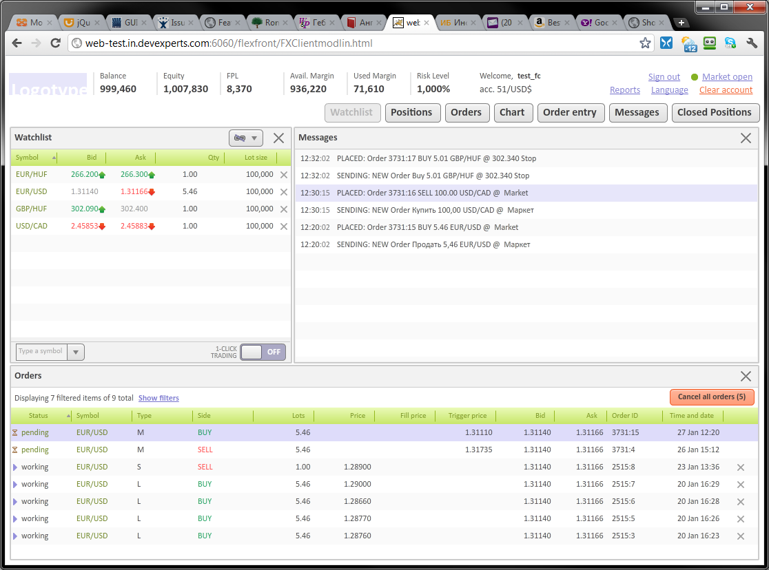
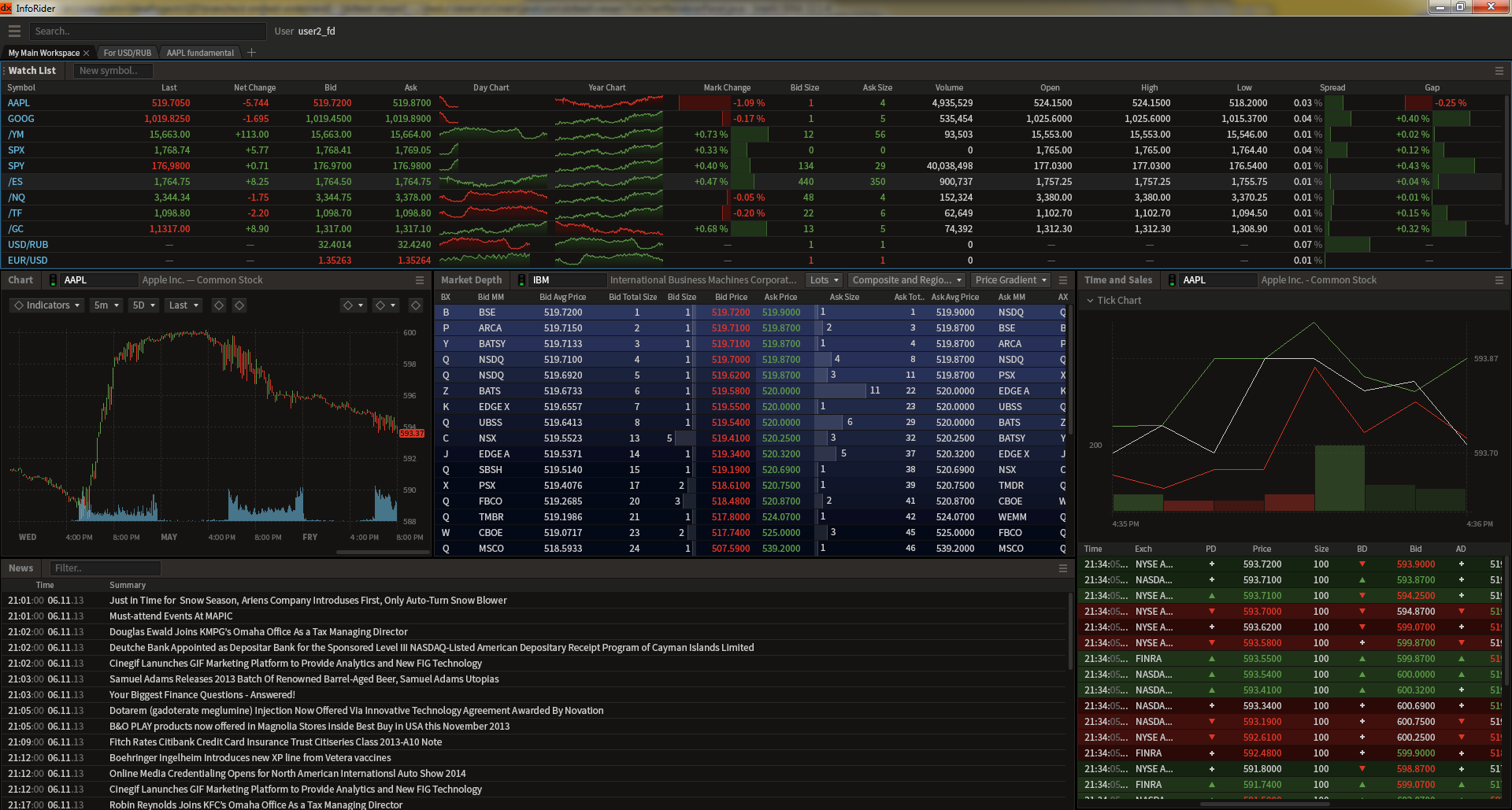
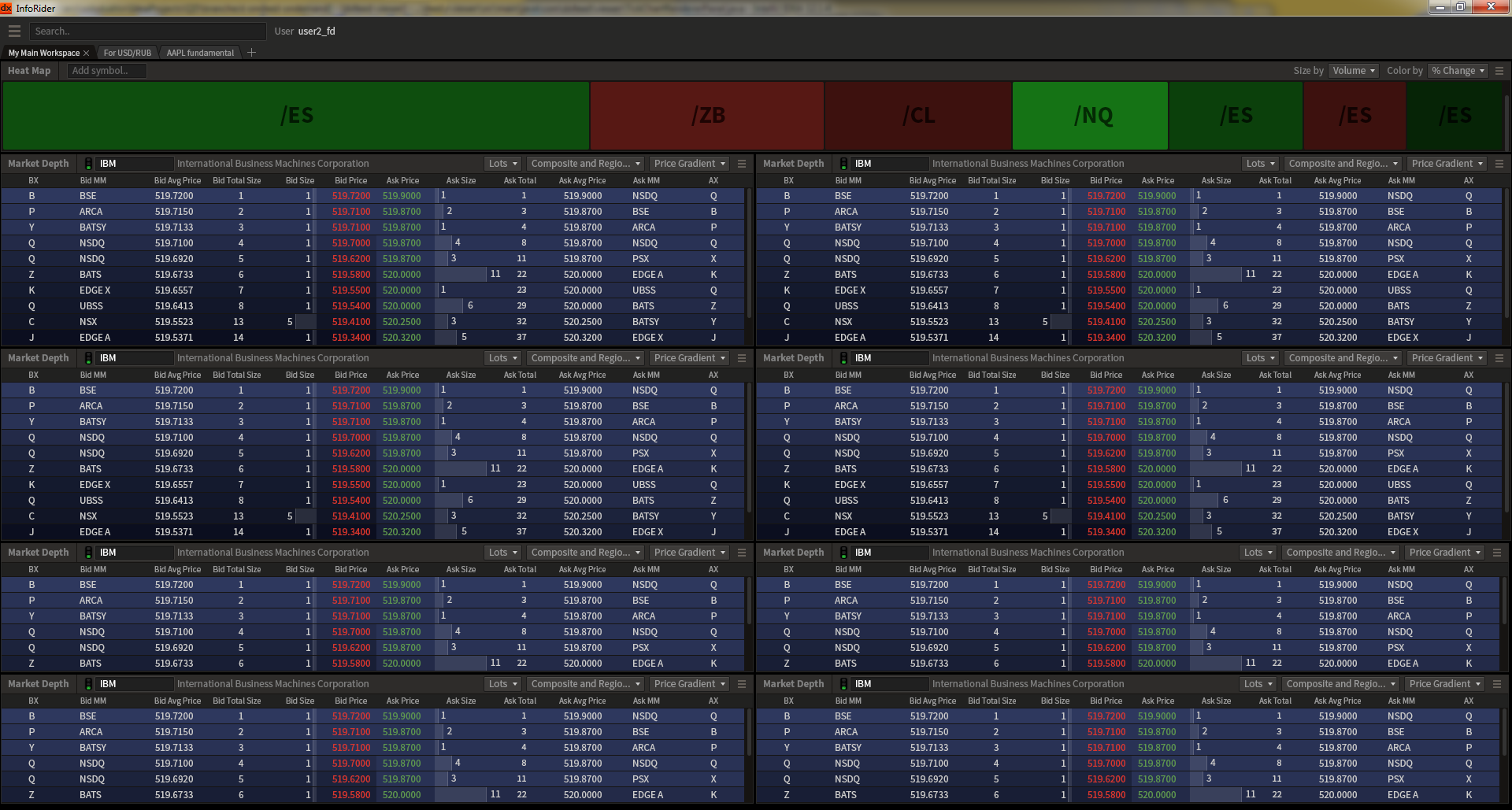
dxTrade 5

Speaking about the workflow, I should note that the main idea of the process was to combine wireframing with application’s graphic design creation. We started with several full screens filled with widgets, controls and data. Three or four screens in particular can give you a true-to-life view. A snippet is in its place, it is not taken out of context, so you can see the whole picture. Otherwise being nicely in place on one screen, the same snippet could disappear or drop out on another .
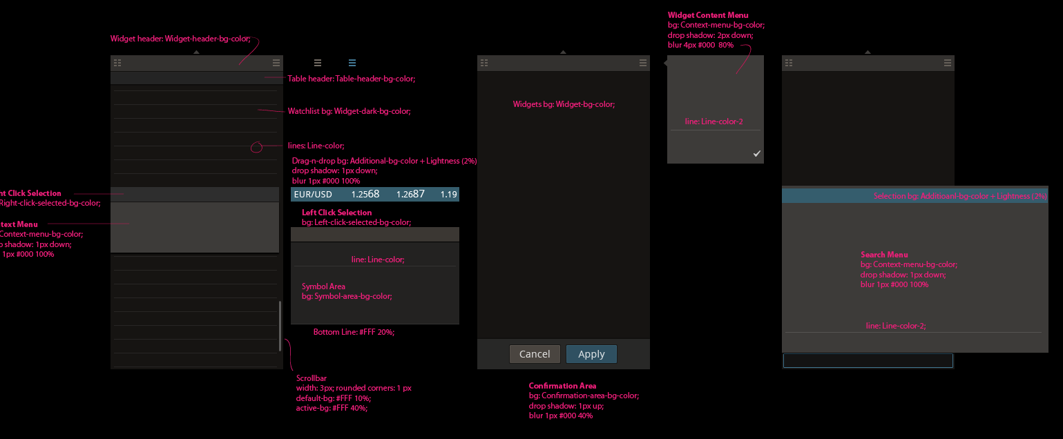
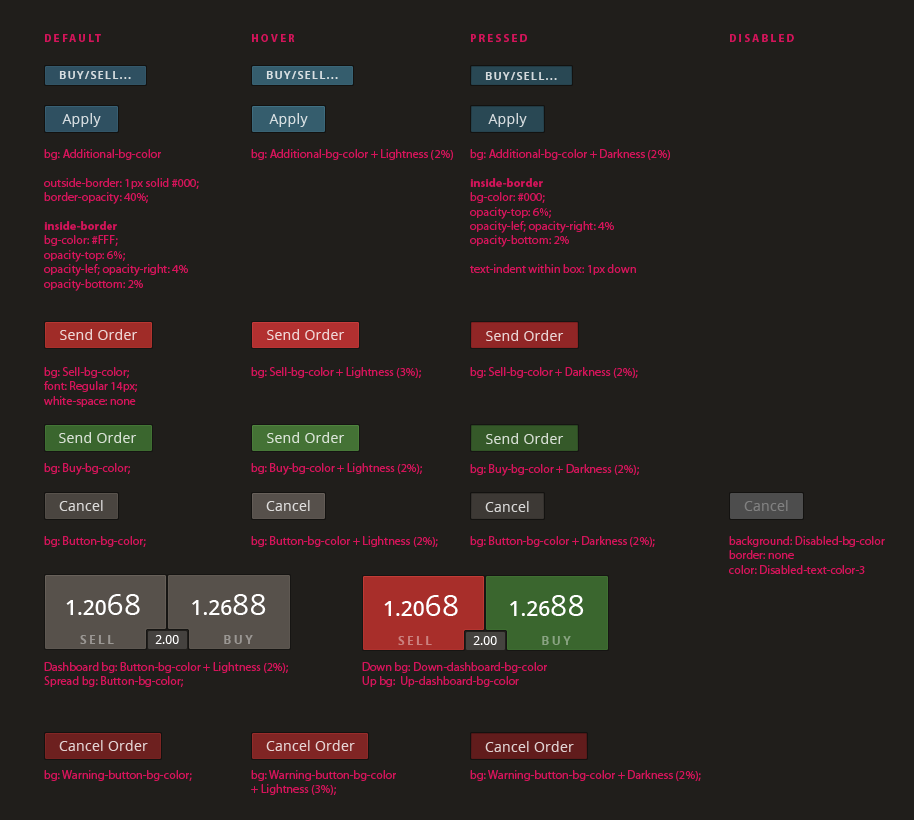
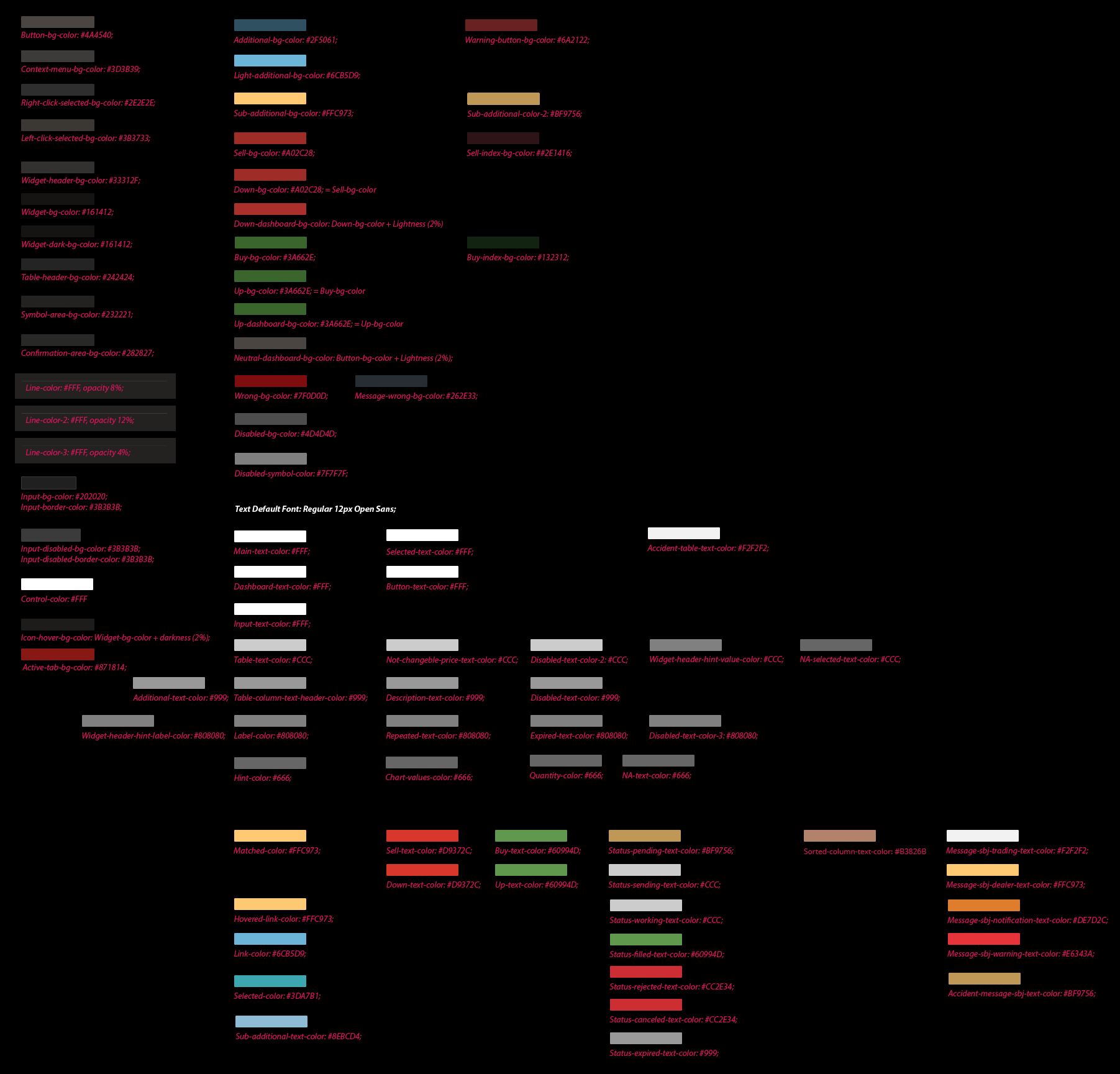
We thus have ensured a solid foundation.We have worked out common user experience patterns during prototyping, developed basic palette and UI-kit, that make us capable of using some elements even on the stage of project conception. Now all these resources are used in all the applications and they all look like the integral suite.
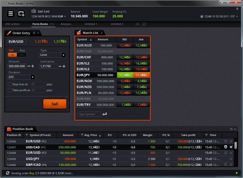
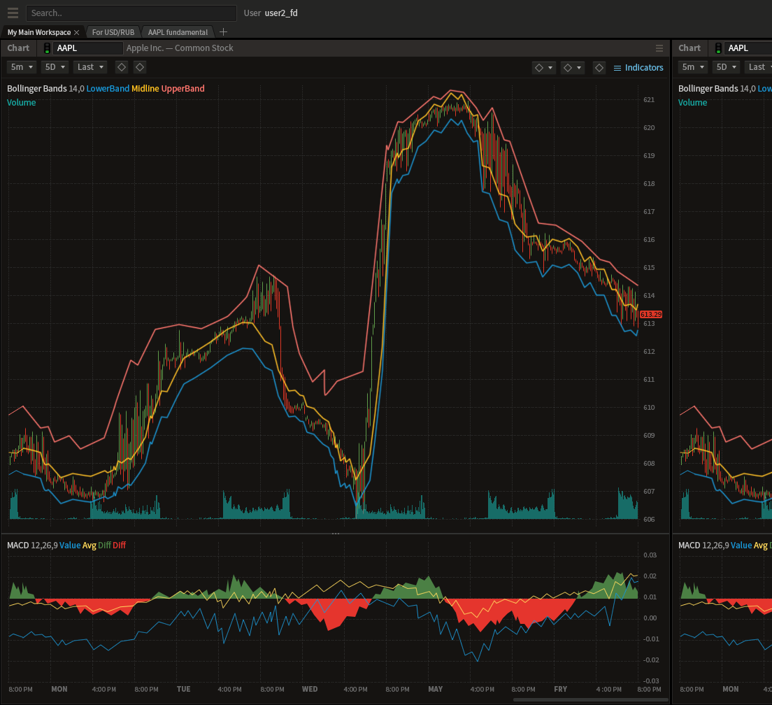
dxTrade Pro
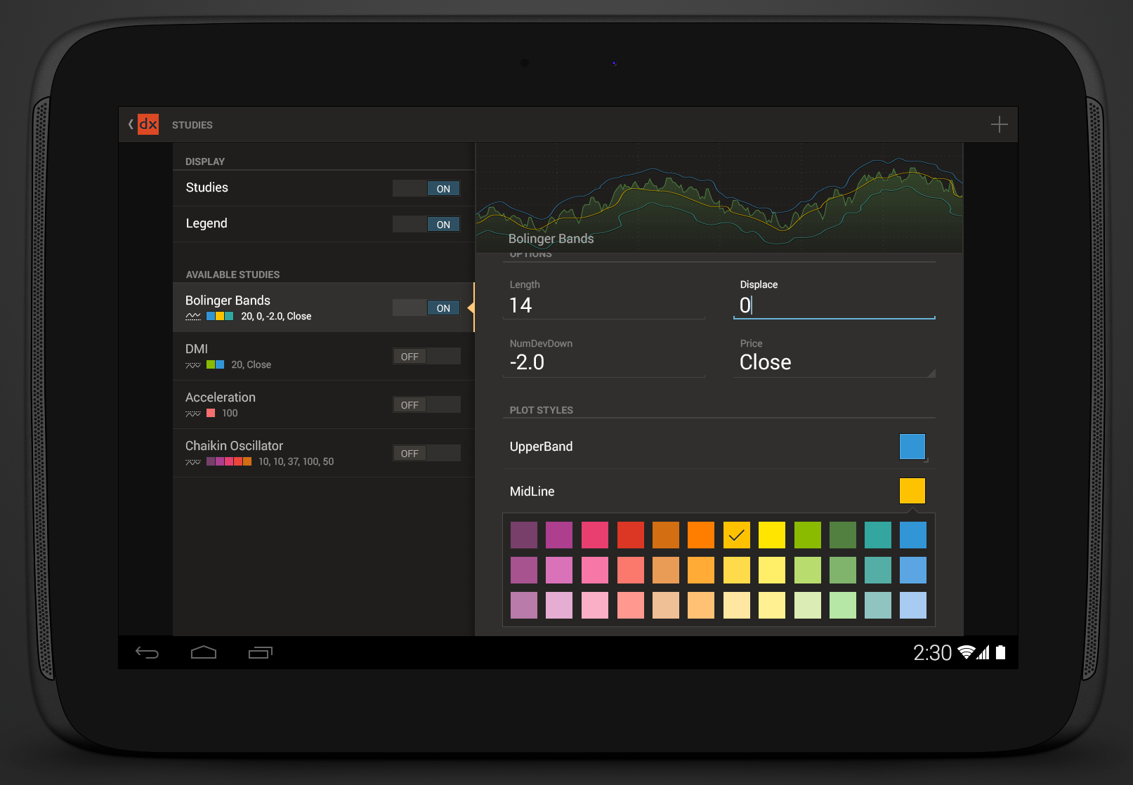
dxTrade Mobile Android Tablet

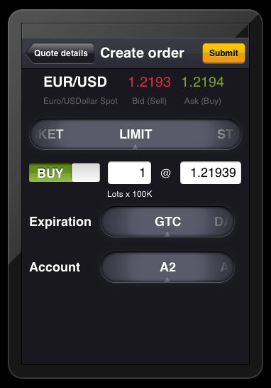
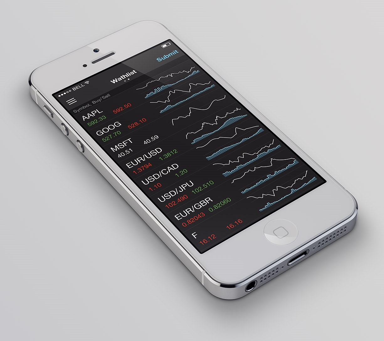
dxTrade Mobile iOS iPhone

So we have risen to this challenge. The described method has given a good account of itself. As a result, we are re-executing all dx-applications. Since we have a good base we are ready for the future growth and new challenges.